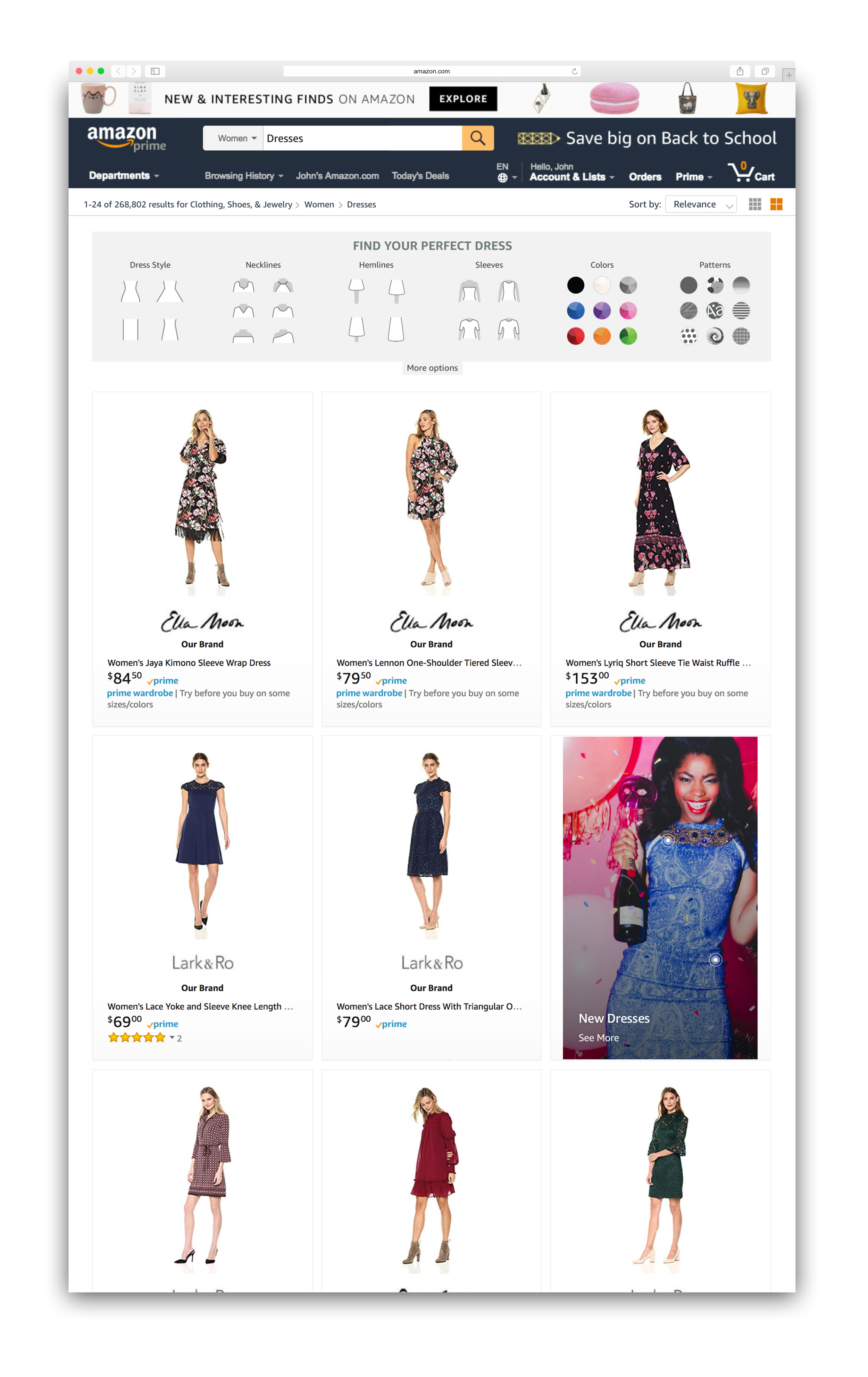
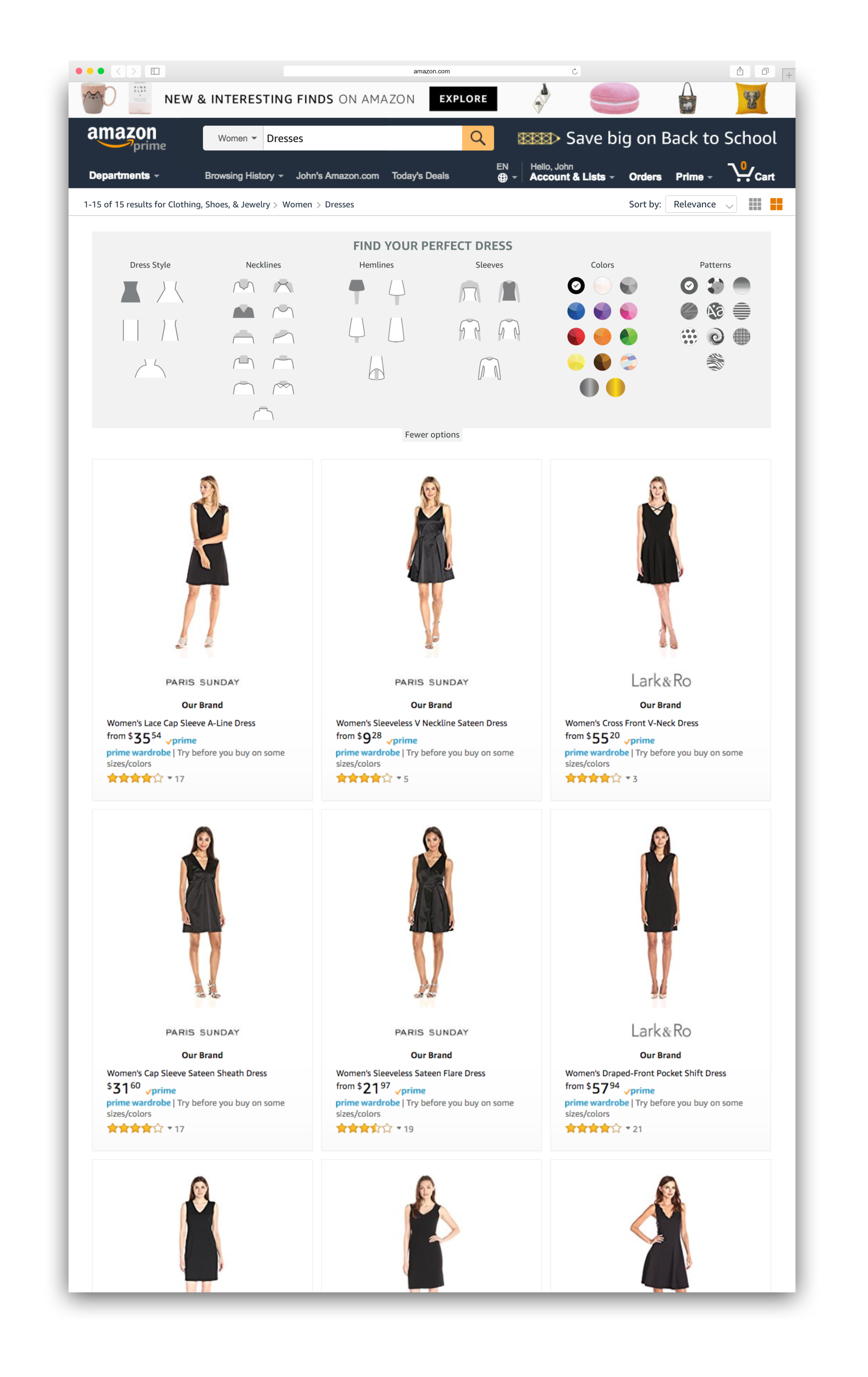
AMAZON FASHION: DRESS FINDER
Problem: There are over 700,000 search results for dresses on Amazon. How can a customer find a dress they love without using words and feeling overwhelmed by the results?
Solution: Willow, a visual dress finder that allows customers to search for dresses using icons with better search term data.
Tasks: UX for desktop experience. All visual graphics, icons, ingress banners
Icon Design:
Design icons that show the customer attributes for the dress design.
These include:
Color
Pattern
Dress Silhouette
Neckline
Hemline
Sleeve Length
Sleeve Type
USER TESTING
After user testing, participants really loved the experience. It was fun, easy, and useful.
Things that were confusing:
1. Dress Silhouette: At first glance, the icons for silhouette looked like a completed dress. All participants selected the dress silhouette as a completed dress instead of just the waistline/shape. Example: One participant wanted a conservative dress for a wedding, and selected the "gown" silhouette because it was long, even though she would be able to select "long" as hemline.
2. Color: Because the color icons were solid, 5/8 participants were confused about what color to pick, for example, if one wanted a magenta dress, would they select pink, purple, or both?
I implemented this feedback with the updated icons for color and silhouette.


