PRIME WARDROBE
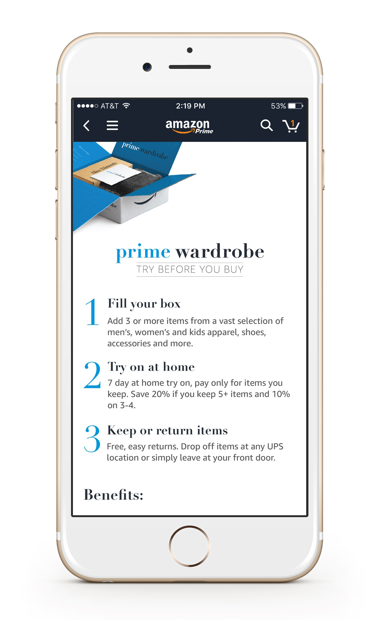
Problem: The existing "Learn More" pages were confusing to customers while trying to get information about Amazon's new"Try Before you buy" program.
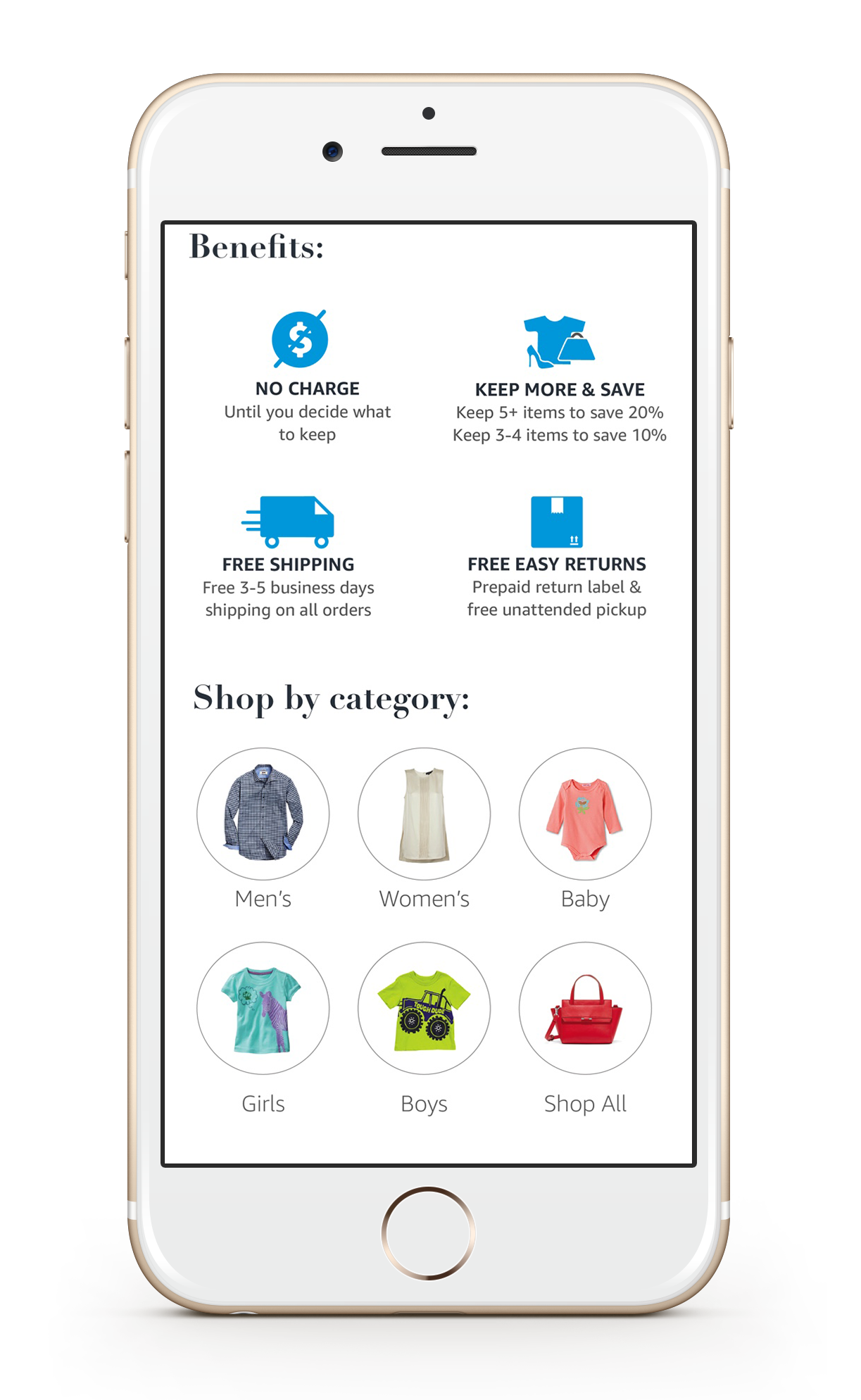
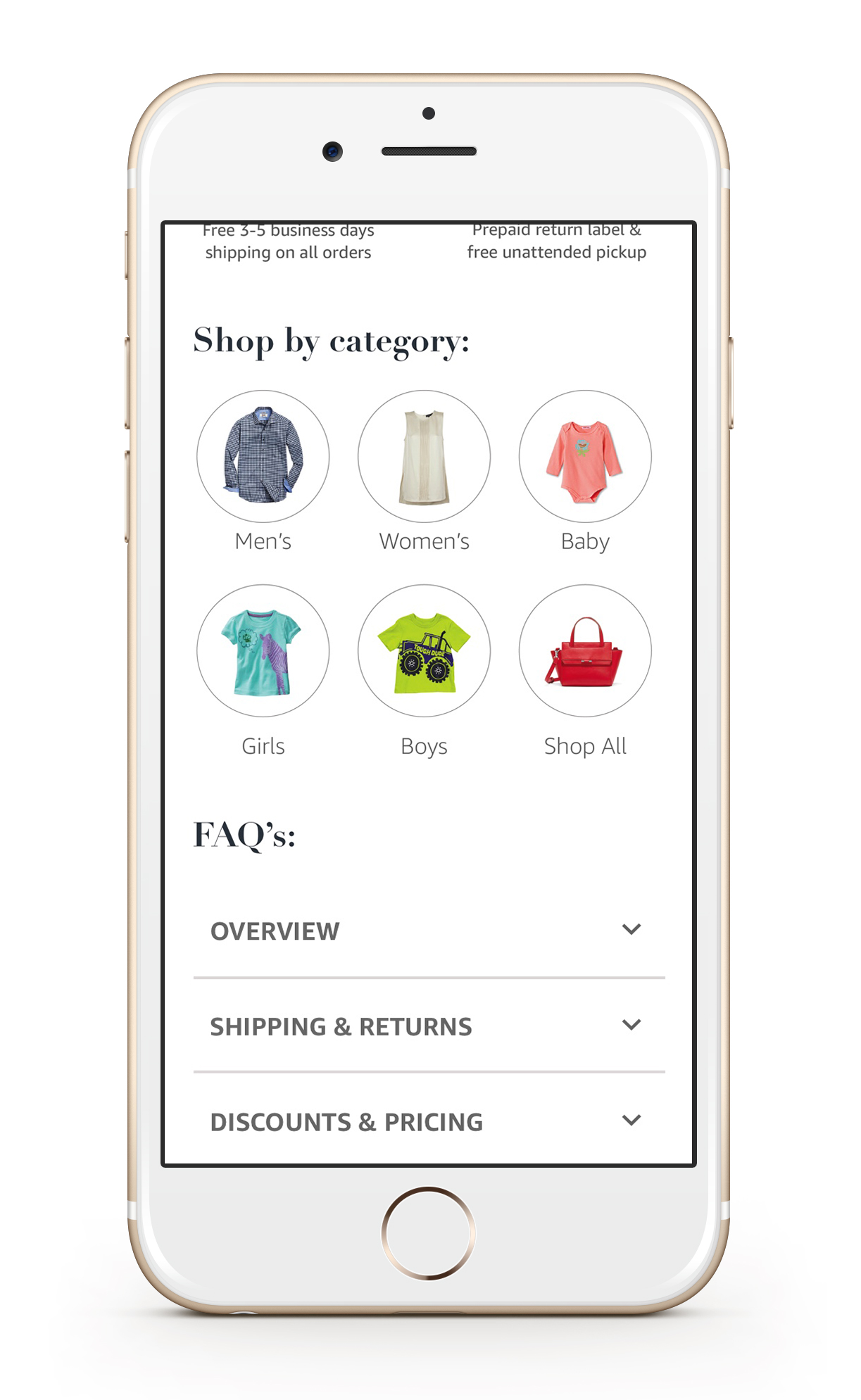
Solution: Redesign "Learn More" Pages that highlight and explain the discounts, selection, and returns.
Products: UX for desktop and mobile.
Existing page design
Existing page confused all participants in User Testing. The discount messages and benefits were unclear.
-Designed a new experince
-New Icons
-Worked on new copy to provide clear and concise direction to the customer.


